Paper wedding sign ideas are easiest to manage when the signage is planned as a small system. A welcome sign introduces the event, a seating chart directs guests, and table numbers or directional cards answer specific questions. Each piece needs enough contrast, a stable support, and wording that can be read at its intended distance. The paper backdrop guide can help with viewing distance, while the table centerpiece guide covers how much clear space event pieces need.
List the signs that solve a guest problem
Start with the messages guests need when they arrive: welcome, ceremony direction, seating or escort information, table number, menu, bar, guest book, cards and gifts, or an unplugged-ceremony request. The exact list depends on the venue and event plan. A sign that no one needs may still be decorative, but it should not take priority over navigation.
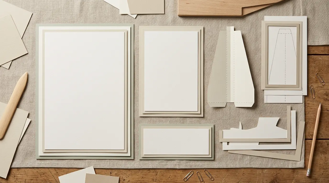
If the seating display contains many names, treat it as a text-heavy piece. Keep the welcome sign and bar sign more open if you want a handmade paper border or a layered motif. IfShe’s signage guide makes the same practical distinction: use precision where the amount of text is high and reserve more decorative freedom for short messages.
Choose the size from the reading distance
Measure where guests will stand when they first read the sign. A title seen at the entrance may need to work from several steps away, while a small table sign is read from a seated position. Write the final wording before setting the panel size so the letters do not become an afterthought.
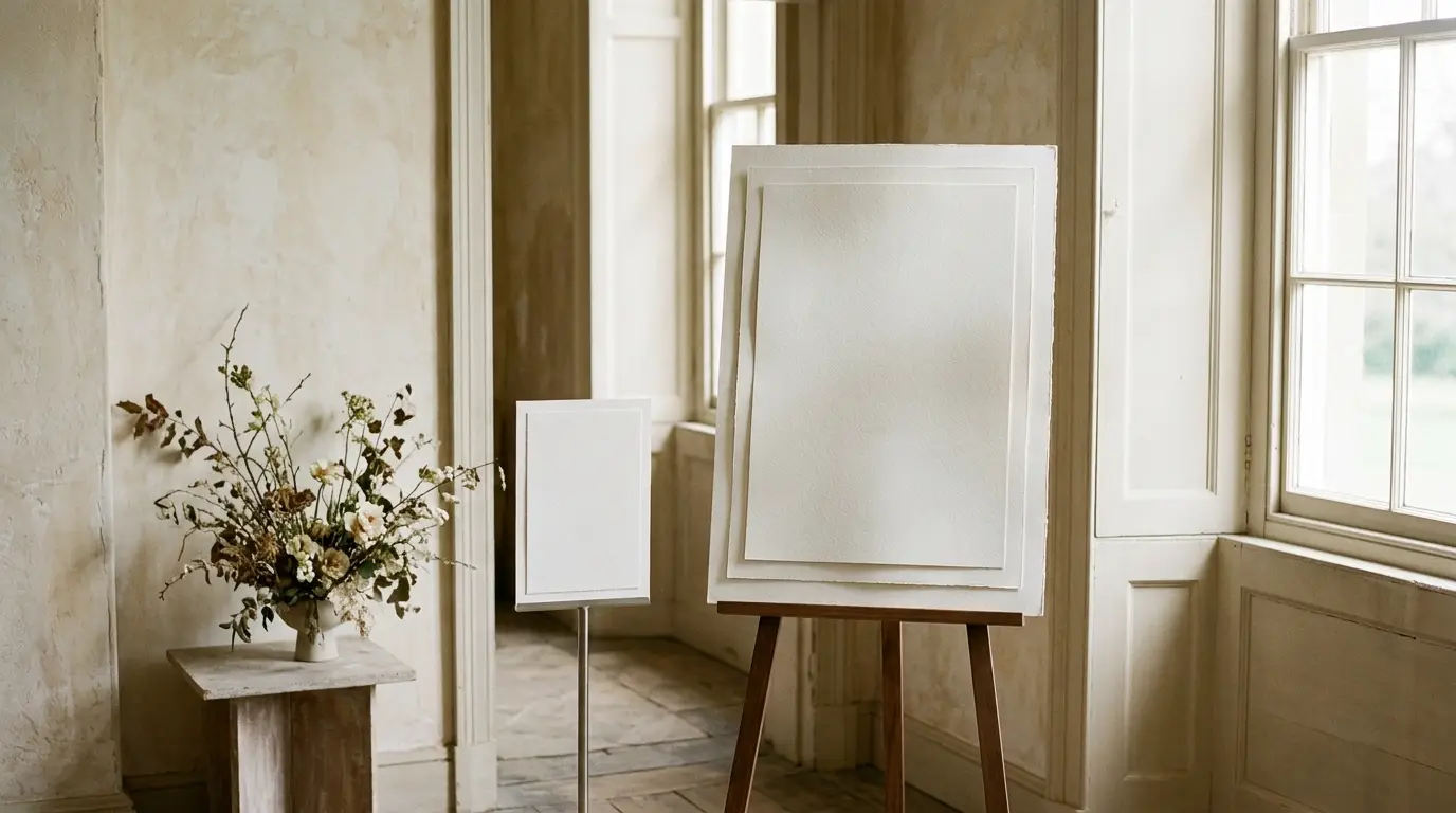
Make a paper proof with the real text and hold it at the intended distance. Check the smallest line, not just the main names. Leave enough margin around the message for a border, mounting edge, or frame without squeezing the type toward the center.
Use one type system and one color story
Choose one display style for headings and one straightforward style for details. Keep the same relationship on the welcome sign, seating chart, table numbers, menus, and place cards. A single motif or paper accent can connect the pieces without filling every empty corner.
High contrast helps information survive changing room light. Pale lettering on textured or patterned paper may look soft in a photo but disappear at the venue. Check the proof under the lighting where the sign will be used and simplify the background if the text is hard to read.
Choose a backing and stand
A paper sheet may need a rigid backing before it can hang or stand. Decide whether the finished sign will be framed, mounted to board, clipped, suspended, or placed on an easel. The backing should stay flat and the stand should support the actual weight, including any frame or decorative layer.
Living on Saltwater’s two-sided welcome and seating sign shows one way to reuse a support between parts of the day. A similar approach can work when the venue allows it, but the panel, hardware, and mounting method must be checked as one assembly. Do not assume a paper sign can carry the load of a large frame or acrylic sheet.
Plan for outdoor exposure
Moisture and wind change the problem. Keep paper away from rain, wet grass, sprinklers, and condensation unless the chosen material and finish specifically allow that use. A freestanding sign needs a base that will not tip on the venue surface.
IfShe’s guide recommends weighting an outdoor easel, using a hard surface when possible, angling the sign back, or mounting it to a stable structure. These are planning options, not a universal guarantee. Follow venue rules and the stand maker’s instructions, then test the complete sign before the event.
Make a proof set before the final print
Print one welcome sign, one text-heavy sign, and one table number or small directional card. Check the type, margins, color, paper feed, fold or trim, and support. Cardstock Warehouse’s table-number guidance uses a repeatable template approach; Paperlust also emphasizes keeping paper, color, and typography consistent across the table system.
Mark the approved version and lock the wording before copying it across the rest of the set. A late change to a seating chart should not require redesigning the welcome sign or table numbers.
Common mistakes
- Choosing a beautiful panel before writing and measuring the actual message.
- Using decorative type for the smallest or most important information.
- Ignoring the weight of the backing, frame, or stand.
- Putting a paper sign outdoors without a plan for wind and moisture.