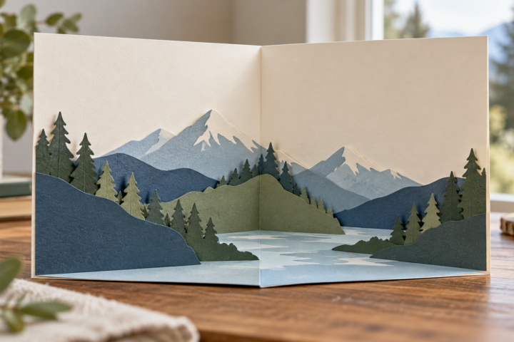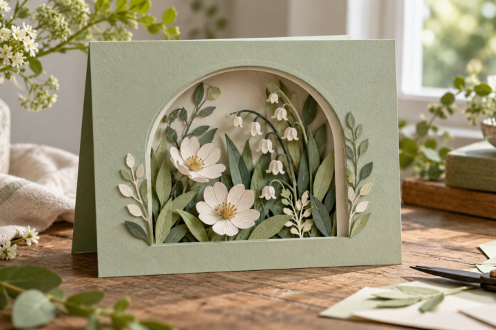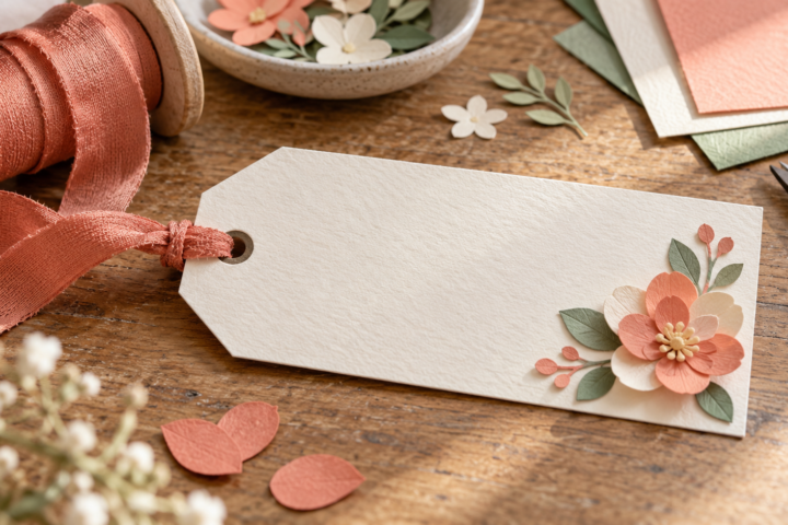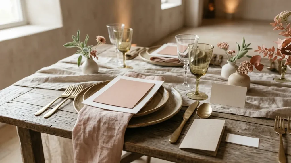
Paper wedding menu card ideas have to fit two jobs at once. The card should tell guests what they will be served, and it should sit comfortably within the place setting. A folded menu, layered panel, or slim card can all work when the writing area, paper choice, and table footprint are decided together.
This is a planning guide, not a record of a printed wedding suite. No menu template was downloaded, printed, or tested for this article. Confirm the final menu, printer limits, paper compatibility, and venue setup before producing the full guest count.
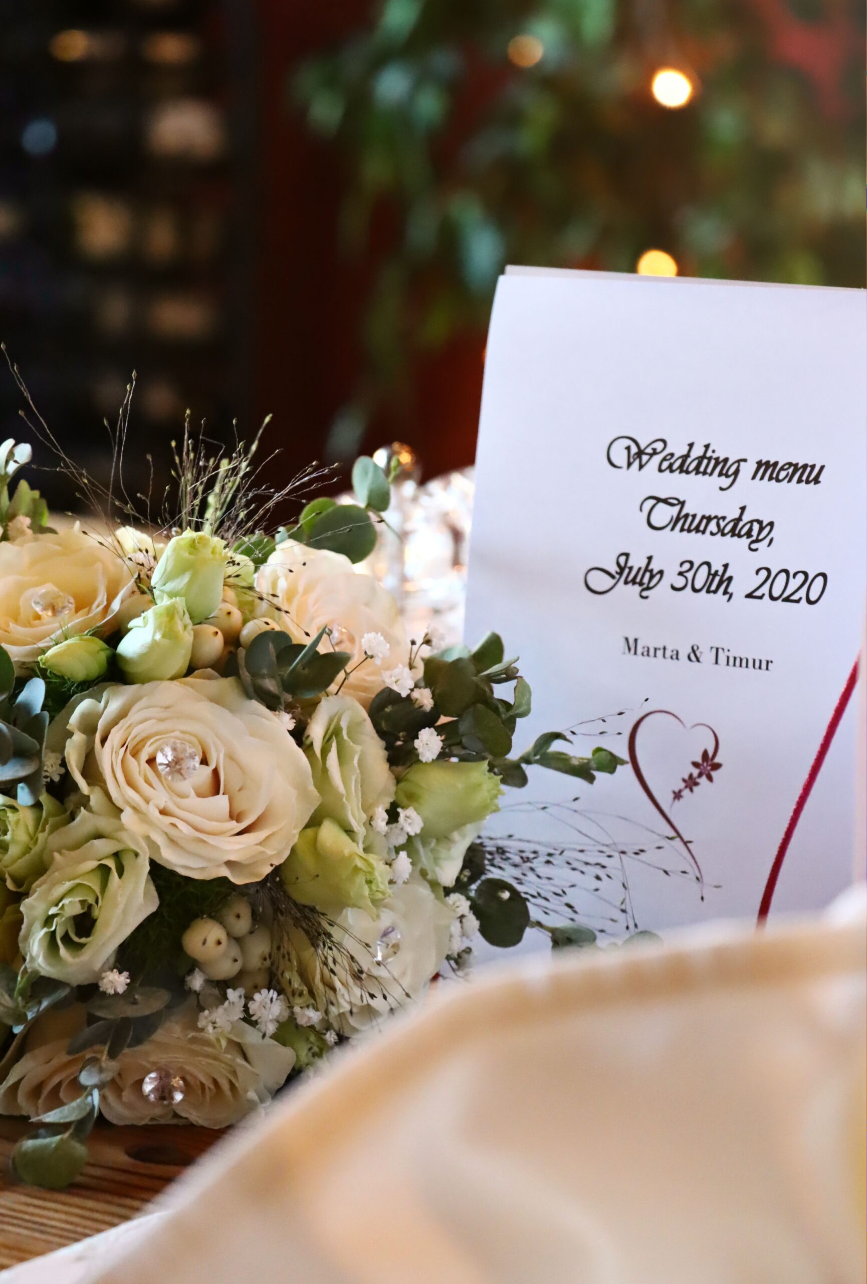
Decide whether the menu is separate
A menu can stand alone, share a card with the guest name, or sit inside a folded place card. A separate card gives the menu more room and makes it easier to update the meal information. A combined card uses less table space but leaves less room for type, dietary notes, or a decorative border.
Start by listing the information that must appear. The number of courses, wine notes, allergen information, and service details affect the available writing area. Do not choose a small ornamental format before knowing how much text the card needs.
Choose the display format
A flat card can rest on a plate or napkin, while a tent card stands without a separate holder. A layered card adds a border or backing sheet and can repeat the colors used on the invitation or place card. A narrow menu can work as a napkin band when the text remains readable after folding.
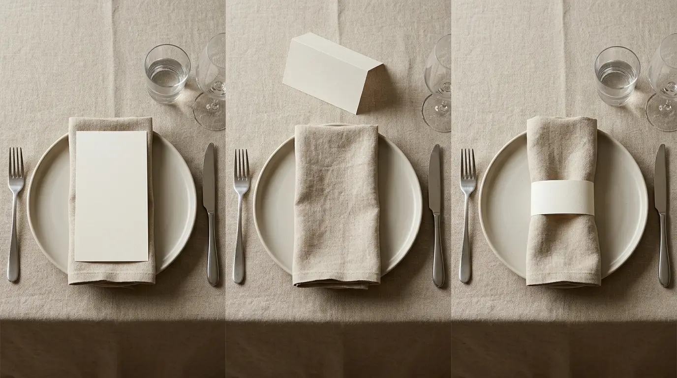
Check how the format will be handled. Guests may pick up a flat menu, unfold a tent card, or slide a band away from the napkin. The display should not force the menu to sit under a glass, touch food, or occupy the space needed for cutlery. The paper place-card guide covers related decisions about writing area and table fit.
Build a clear type hierarchy
Give the event name or course headings a clear role, then keep the dish names and descriptions easy to scan. One decorative typeface can be enough; the rest of the card should rely on spacing and contrast. A border, illustration, or paper layer should frame the text rather than make the menu harder to read.
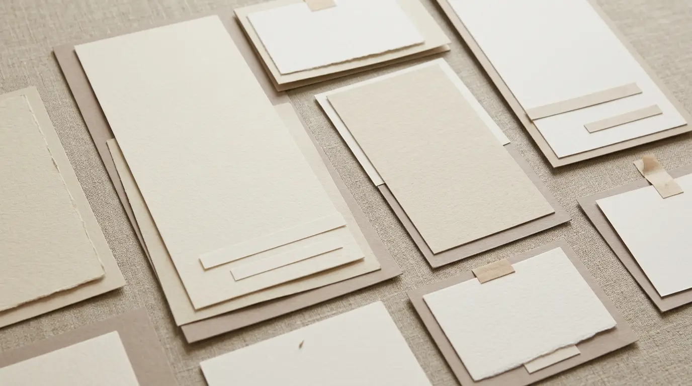
Leave room around the longest line. A menu that fits only because the text is reduced to a tiny size is not solved by a prettier border. Draft the full wording before you finalize the card dimensions, then check the smallest line from the distance where a seated guest will read it.
Choose paper and a print path
Paper affects both the appearance and the way the card behaves. A light insert may be easier to print, while a heavier outer sheet can provide a cleaner fold or layered backing. If the design includes several layers, test the combined thickness in the fold, pocket, or holder.
Printer instructions vary by model and paper finish. Check the feed path, maximum stock, printable area, and whether the sheet should be scored before folding. If a print shop will produce the menus, ask for a proof on the chosen stock. The cardstock guide explains why a general paper-weight recommendation cannot replace a project-specific test.
Coordinate the stationery suite
Use one visual system across the menu, invitation, place card, and table number. Repeating a border, leaf silhouette, color pair, or paper texture is usually enough. The cards do not need to be identical, but they should look as if they belong to the same event.
Keep functional differences visible. A menu needs more text; a place card needs a name area; a table number needs to be found quickly. If one design element appears on all three, vary its scale instead of copying the same crowded layout onto every piece. For the broader table arrangement, see the paper centerpiece guide.
Proof the full guest version
Print one menu with the longest wording and one with the shortest. Check the contrast, fold, trim, border alignment, and the space left for any guest-specific detail. Place the proof at a real setting with the same plate, napkin, glass, and centerpiece height.
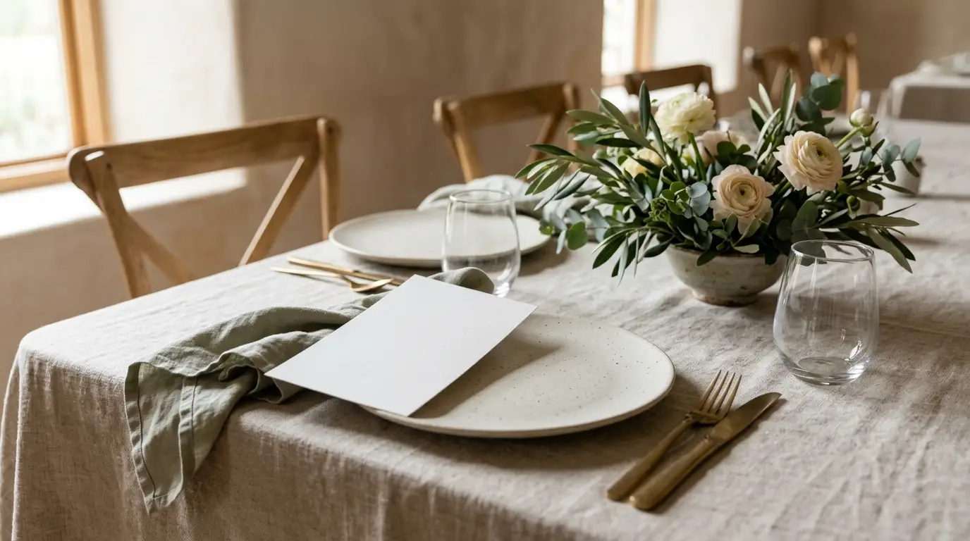
Keep a final text file separate from the design file. This makes it easier to correct a spelling error or update a dish without rebuilding the visual system. Before the full run, count the menus, sort any combined place-card data, and keep a small number of extras for late changes.
Common mistakes
- Choosing the card size before writing the final menu text.
- Using a decorative font for every line and losing the hierarchy between headings and dishes.
- Assuming a printer will feed the chosen cardstock or textured paper without a test.
- Making the menu too tall or wide for the place setting and serving space.
- Proofing the card on a screen instead of beside the actual plate, napkin, and centerpiece.
Disclosure: This guide contains no affiliate links. It describes planning choices supported by the named sources and does not claim a completed printed menu-card set.